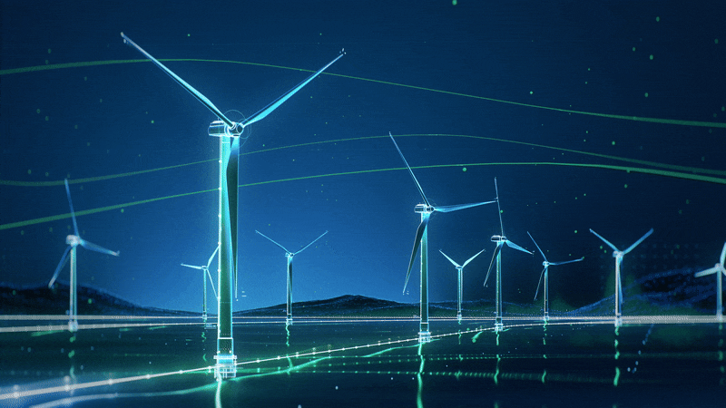
Client: KEEN is an experienced commercial renewable energy consultant company based in Michigan.
Source of discomfort: The Brand was just starting out and needed an impactful brand identity to be distinctive and stand the test of time.
Therapeutic remedy: Upon completing a thorough Design Discovery, the brand was positioned as the leader in Sustainable Energy Solutions.
The brand required a distinctive brand identity to establish its presence in the sustainable energy sector. The logo design features a bold, modern wordmark utilizing the PP Neue Machina typeface, reflecting the brand’s technical expertise and forward-thinking approach. The custom iconography incorporates elements symbolizing wind and solar energy, aligning with KEEN’s commitment to clean energy solutions. The color palette—comprising green, blue, gray, and black—evokes a sense of environmental responsibility and technological innovation. This cohesive visual identity positions KEEN as a leader in sustainable energy solutions.