Client: Minneapolis St. Paul Agency (MSPA) is an independent insurance agency with over 40 years of experience, delivering expert coverage and risk management advice to business and private clients across the region.
Source of discomfort: With a growing client base and a rapidly shifting industry, MSPA needed a brand identity that would honor its four-decade legacy while clearly signaling its agility and commitment to the future of insurance and risk management.
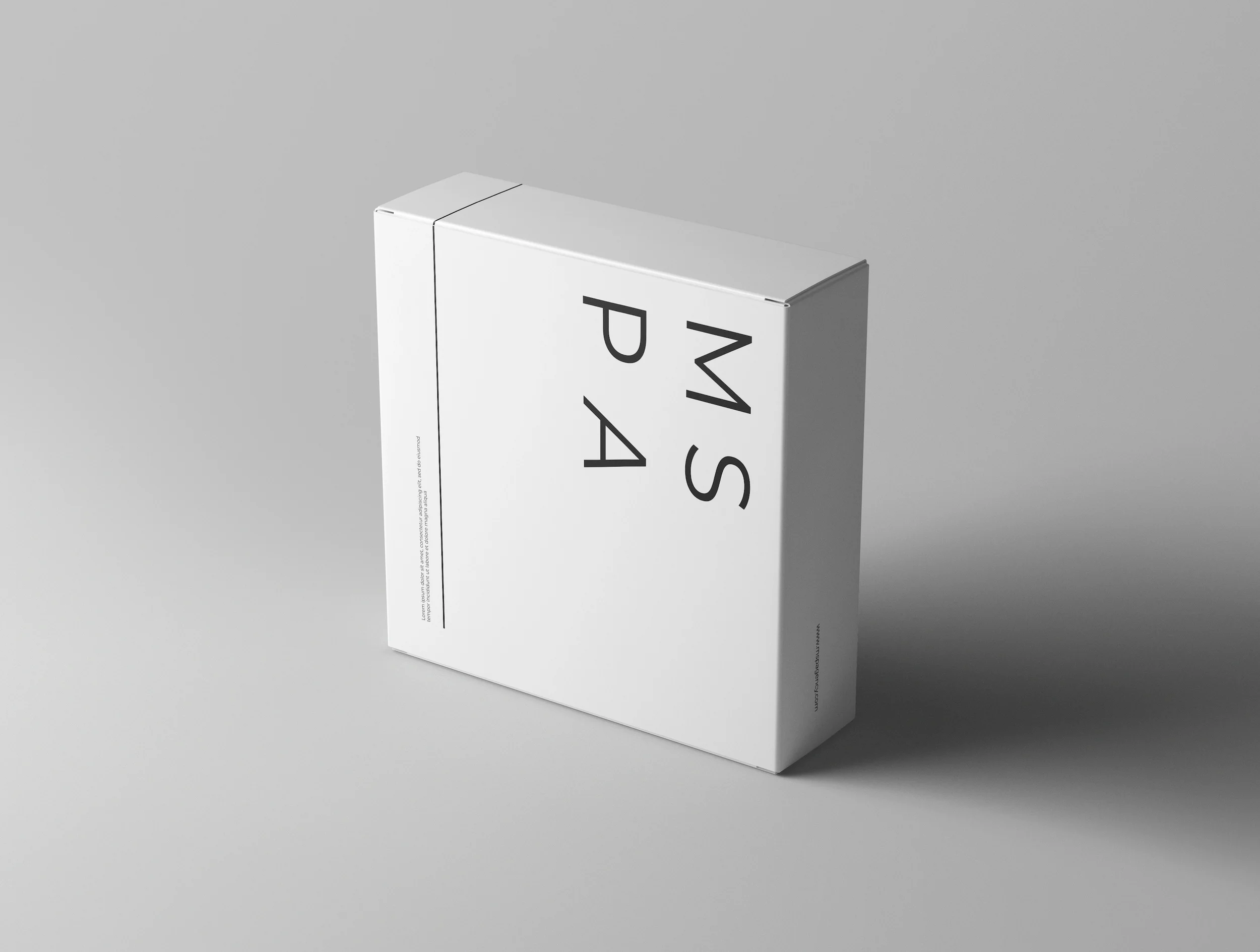
Therapeutic remedy: Through a full-scale branding process including Design Discovery, Logo Design, and a comprehensive Brand Book we crafted a minimalist, modern, and approachable identity system rooted in clarity and professionalism.
The logo features Montserrat; a typeface chosen for its strong legibility and timeless structure. The acronym mark (MSPA) creates a clean and versatile brand element, while the italicized “A” introduces a subtle forward motion that reflects MSPA’s progressive mindset. This thoughtful typographic pairing ensures a refined visual hierarchy across all brand touchpoints, allowing MSPA to communicate with clarity, confidence, and approachability.
The final identity strikes a careful balance between legacy and leadership, respecting the company’s heritage while equipping it with the tools to grow into its next chapter.