Client: Top Shelf RE is a Real Estate start-up that leverages new technologies to offer its customers a one-of-a-kind, top-shelf experience.
Source of discomfort: The brand needed a completely custom brand design solution to position itself effectively in a rapidly expanding market.
Therapeutic remedy: After completing an in-depth Design Discovery, Logo Design, and creating a comprehensive Brand Book, the brand was fully prepared for launch.
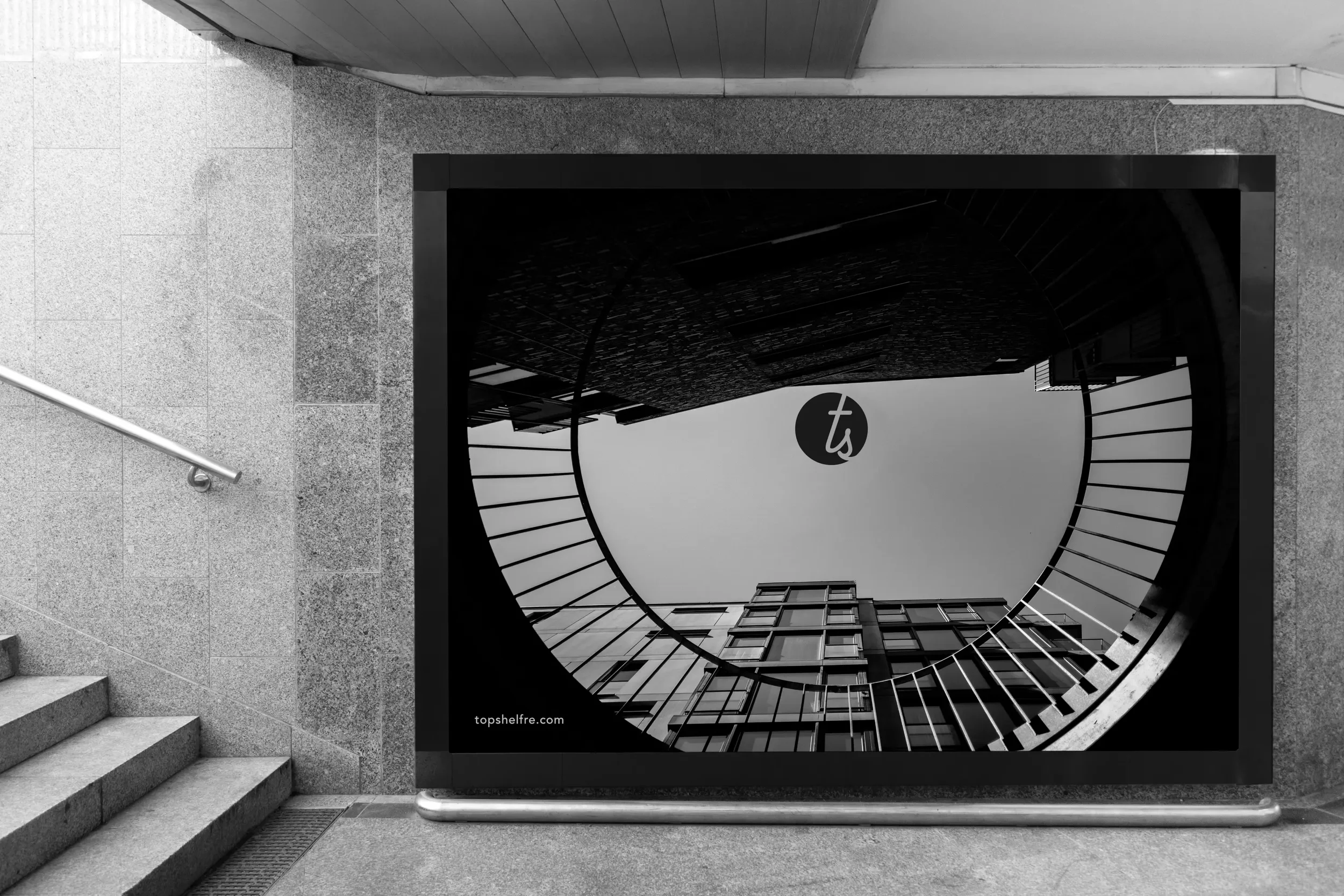
The Top Shelf RE branding was designed to strike a balance between innovation and human connection. Avenir, a modern geometric sans-serif, was chosen as the primary typeface to convey clarity, precision, and confidence; qualities aligned with the brand’s tech-forward approach. To complement this, a custom icon rendered in Sacramento script adds a handwritten, personal touch. This contrast introduces warmth and character, nodding to the company’s Sacramento roots while reinforcing the human side of real estate. The ts icon is intentionally designed slightly off from center, illustrating forward movement. The result is a distinctive, dual-tone logo that’s both approachable and future-facing.