Client: Advocate360 is a digital platform supporting neurodivergent individuals and schools.
Discomfort: The product began with only a name, lacking a clear identity and structured experience to support a neuro-affirming standard.
Remedy: Through focused positioning, UX refinement, and identity, we reshaped Advocate360 into a calm, supportive ally.
-
“The little red sofa will make your brand come to life. We started with a name and a very rough idea of how we wanted our neuro-affirming brand to be presented, and Ian ran with it to make something outstanding. Every color, and line, and shape, word choice, was met with love and intention. By the end, and on a very tight timeline I should add, we were delivered a brand we could feel proud of. I highly recommend the little red sofa to support your brand.”
—Chris Hanson
Founder | Life Skills Advocate, LLC
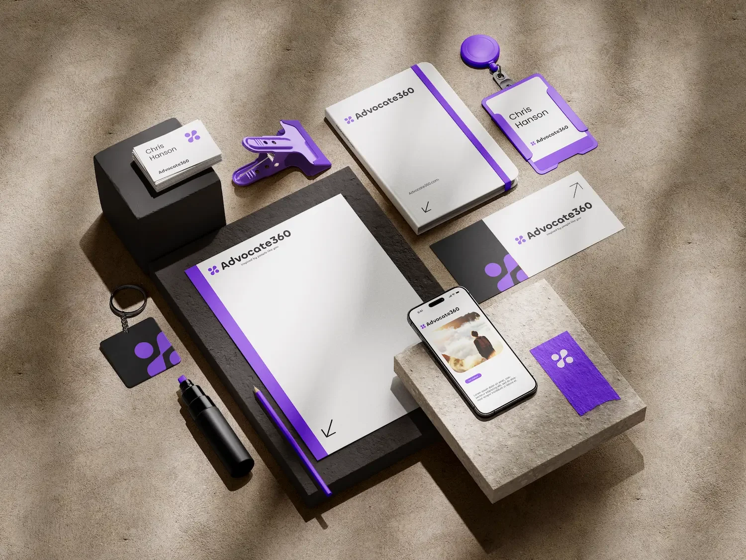
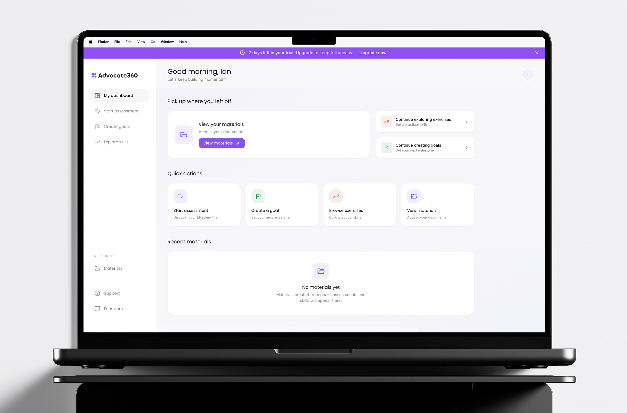
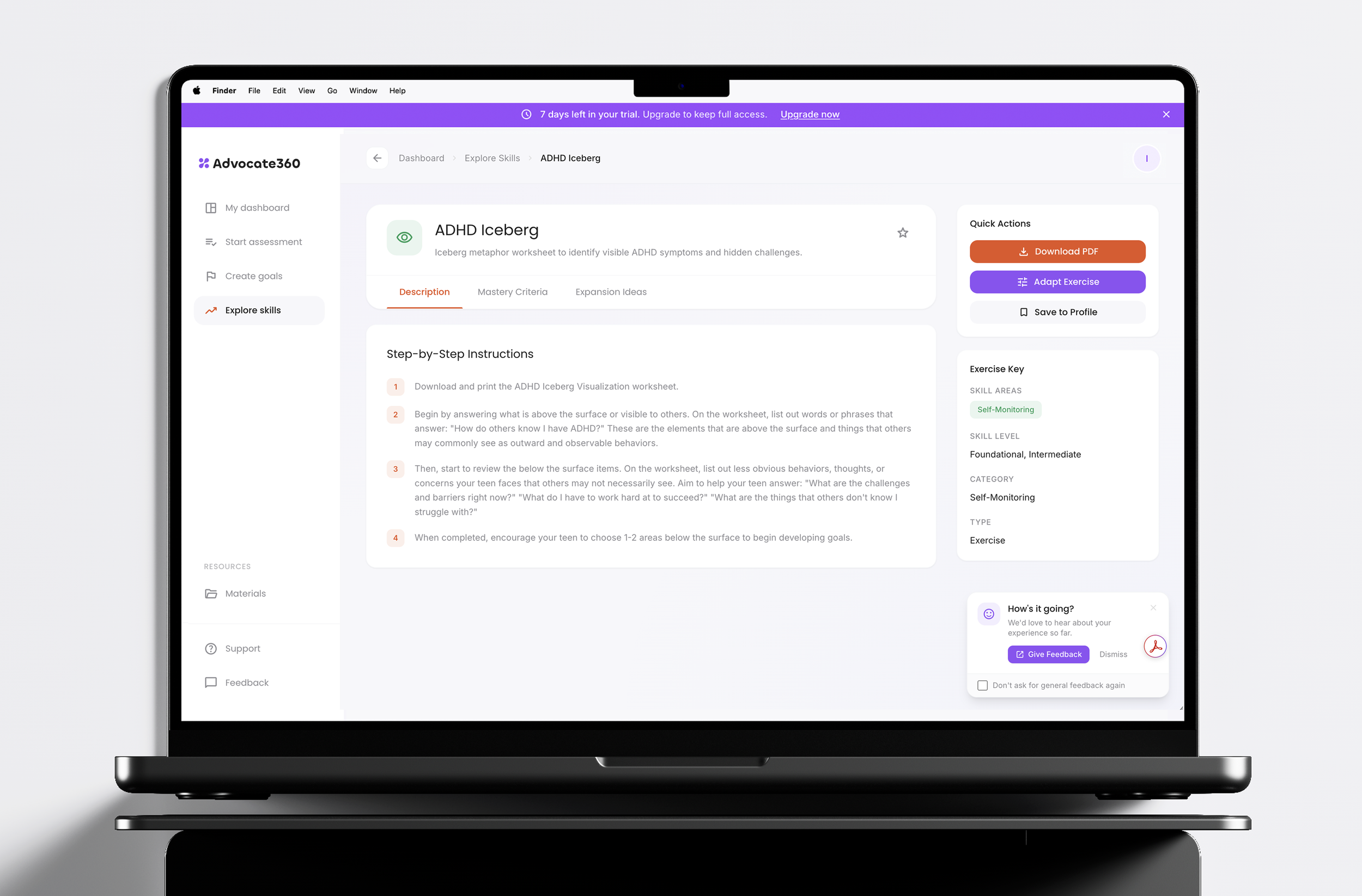
We designed Advocate360 as a system of calm, where brand identity and UX operate as one to create a steady, intentional, and trustworthy experience. A minimal visual language and consistent interaction patterns help users orient quickly, while Advocate360 acts as a quiet ally supporting clear thinking and self-advocacy when it matters most.

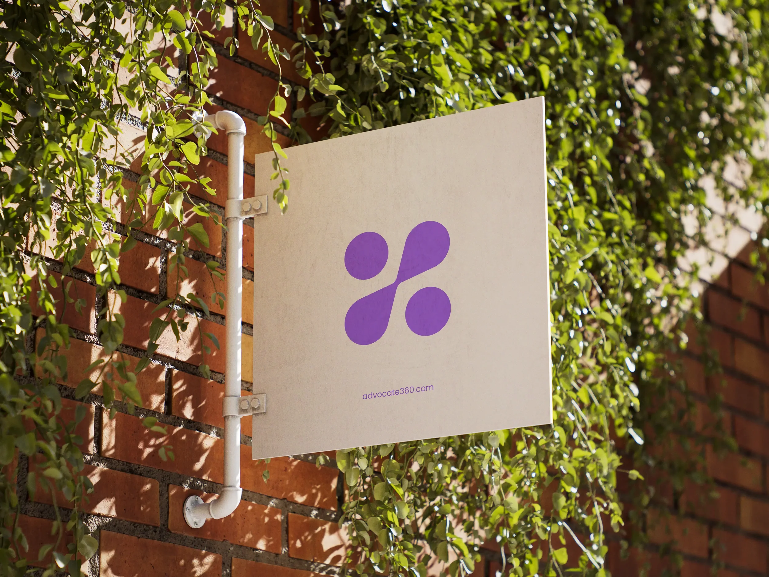
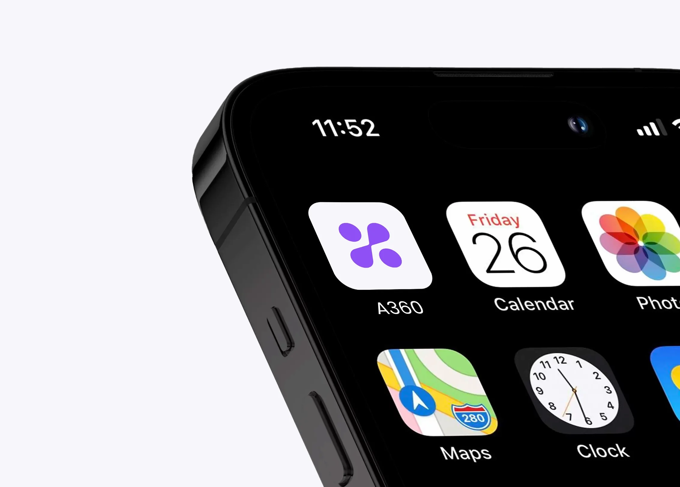
The icon reinterprets the infinity symbol for neurodivergence as a system in motion. Each form represents an individual, distinct and capable, coming together to create balance, connection, and upward momentum through shared support.


Purple has long symbolized imagination and unconventional perspectives.
Advocate 360 is built because people think differently. This color reflects that truth & celebrating diverse cognition rather than trying to correct it.

The Chillax typeface adds warmth and approachability, reinforcing a human and supportive tone.

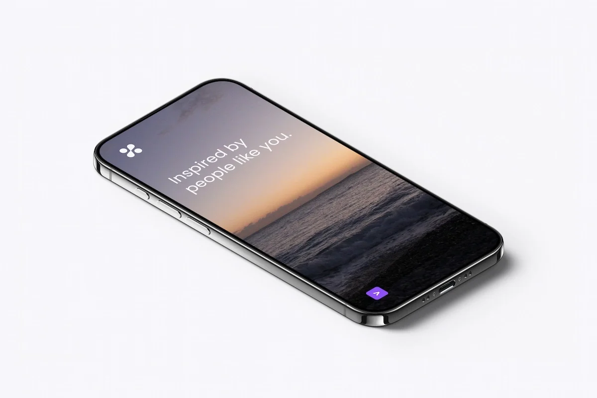
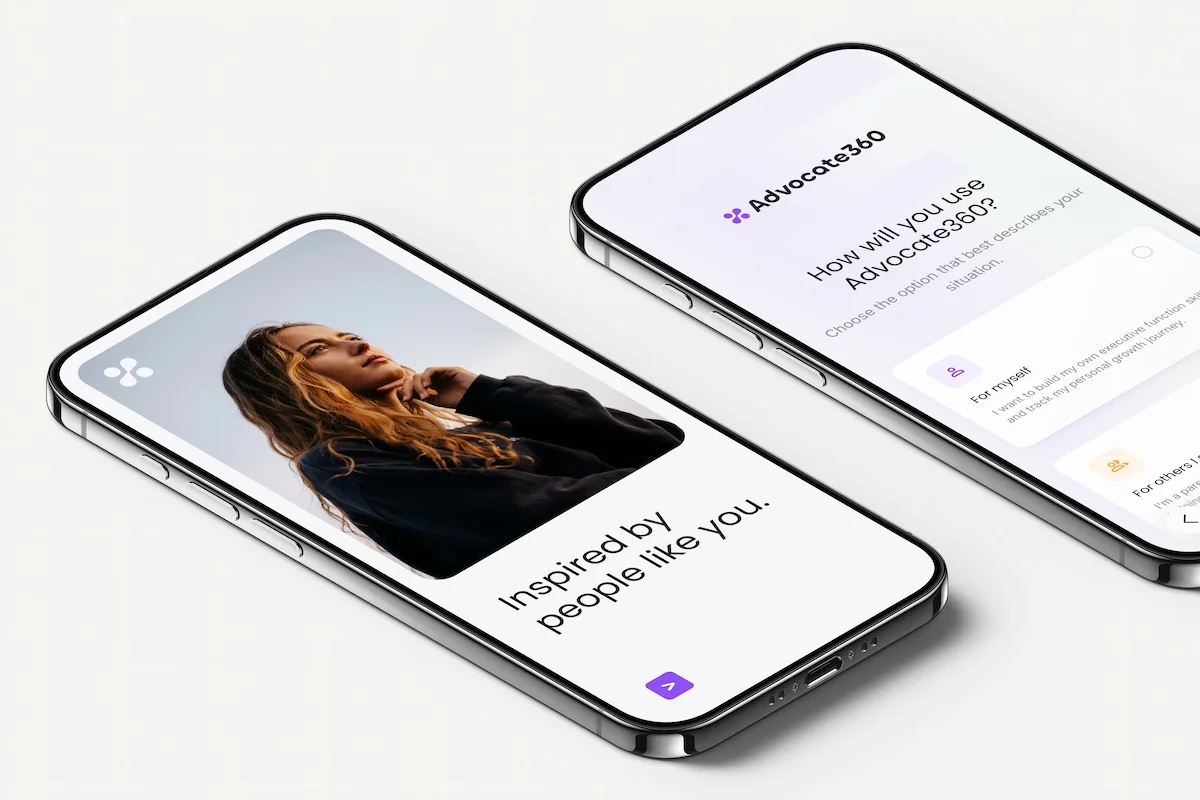
The tagline grounds Advocate360 in lived experience. “Inspired by people like you” reflects listening before designing and reinforces a system built around real people, empathy, and meaningful progress.
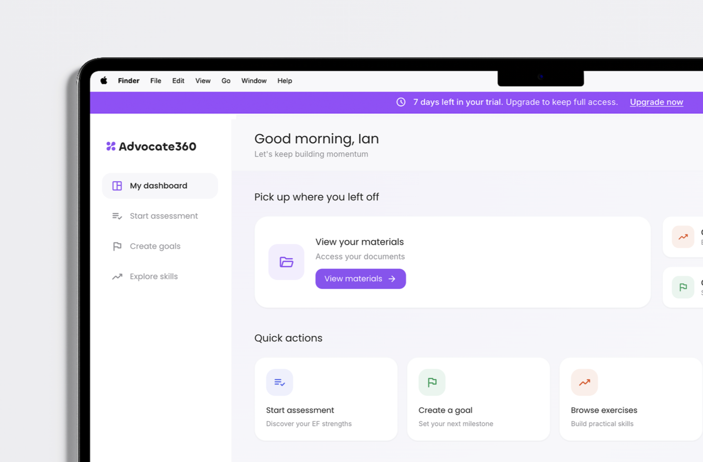
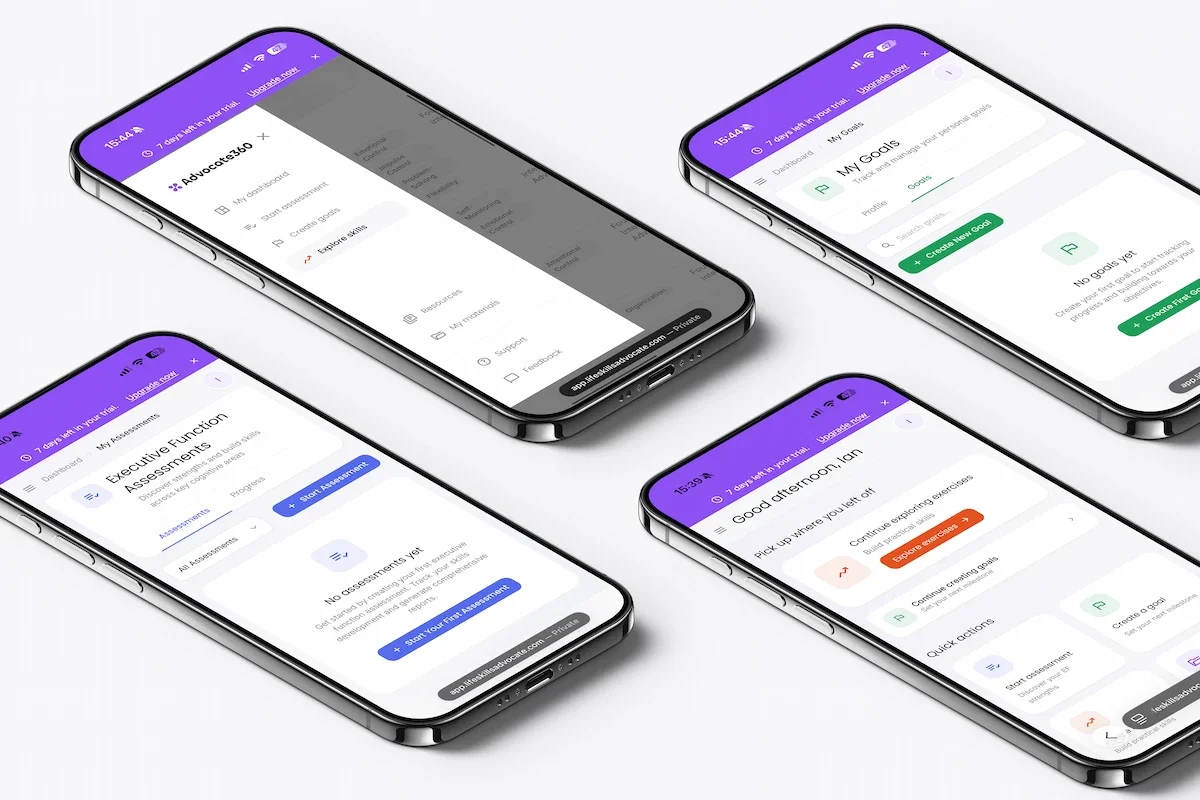
The Advocate360 product experience is calm and composed. A soft grey palette, clear hierarchy, and generous spacing reduce cognitive load and support focus. The interface is predictable, supportive, and intentionally restrained.
Impact
Advocate360 outperformed projected enrollment goals in both B2B and B2C segments, demonstrating clear positioning and strong cross-market resonance.